Editing Blog: Taunting Titles, Text, Transitions, and Entrancing Effects
Welcome one, welcome all, to the last session of editing! For this session, I worked on the titles, transitions, filters, and other minute details.
To pick up where I left off, I thought about what best place to start other than the beginning. To prepare for my endeavor, I pulled out a sheet of paper and wrote down the order in which the titles appear in the film industry, and next to it who belonged to what title. This way, I could keep track of who goes with what and stay in the correct order.
I began with the “Studios Presents” title, which I wanted to have floating around in the pool as our first title. For this title, we all agreed on the name R.P.M.M. Studios, which were our initials in no specific order, just the way that sounded best. I tried to make the words float around using keyframes, but I was not a fan of how they were moving. It looked too fake and stiff, which is usually the effect of using keyframes to try to stop motion edit something. I tried to search for an animation preset that would make them float around, but there was no such thing. Since I couldn't add any keyframes closer together to try to cover as many frames as I could to make it smoother, I had to result to having it fade in and out over the water.
Next were the production company and actor name titles, which I placed in vacant spots of the screen and added a fade-in and fade-out effect. In between these two titles, I added the text “six years later...” in a different color to make it have an obvious difference from the title cards. This text also faded in and out.
For one of the actor’s names, specifically Mackena’s, I had the idea earlier on to have her name come down with the sunglasses holder in the car. For this, keyframes were extra helpful. I placed around ten keyframes in the span of three seconds to animate it as much as possible. I put a fade-in effect to give the illusion the title was coming out of the shadows, and then with each keyframe I moved it down a bit and made it just a little bigger until it was full size and center of the holder when it was down all the way. This took a few tries since I was having the same troubles with the water clip from before, but I expect this by now since usually when I use keyframes to try to animate anything, it usually takes a little while to perfect it.
Now was the part I was excited about... adding the title of the film. Since we had to cut out our one scene of the record player, we had in our storyboard because of our time constraints, the title placement had shifted a bit from where they were originally intended to go. Even with this change, I got lucky as the title landed on the perfect wide shot of Marissa and Riley leaving the car. For this title, I wanted it to wipe in from the side, since to me that reminds me of blood being wiped and it created an eerie and anxious feeling. For this title, I changed the font to the preplanned font called “Got Heroin” and brightened the font color up a shade of red to contrast the other titles.
This next title was a real pain for me to do, but mainly because I brought it upon myself. I got a little overly confident in my editing skills and Capcut’s capabilities when I tried to see if I could cut out the background of a moving object. My initial idea and goal here was to cut out Riley’s arm and the backpack so that I could place the “Casting By” title and have the backpack be placed on top of it. I looked up a bunch of tutorials, spent probably more than thirty minutes trying to cut out the moving figure manually with perfection, and trying green screens and automatic background cutout, all to no avail. I eventually gave up on my idea and settled for the dreaded keyframe animation method I had come up with, but it definitely did not live up to the expectations I had in my head. You win some, you lose some, I guess! When I get better at editing and better editing software in the future, I will be cutting out moving objects and covering titles left and right.
I then added the “Music By” title on the bottom of the bag and did not add any in or out animations to match the abruptness of the bag falling over. I was a big fan of this scene.
Next, I added the “Visual Effects” title, given to Marissa especially since I think she did a phenomenal job with her fake blood art on Mackena, Riley, and the garage scene. This title faded like most of the others. The rest of the titles except for “Directed By” were done in the same way, making sure to place them in vacant and non-busy spots on the screen which I had prepared for when directing.
For the last title, I put it over the black screen after a few seconds of hesitation and added a flicker effect to match the previously flickering lights.
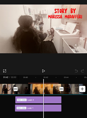
Now that the titles were done and in place, the extra effects needed to be added. I added an effect called “black fade” in between each of the seeking scenes to blend them together more and create a more coherent montage. I then addressed the laundry room flashback scene, where I added a flashing effect to transition in and out of the scene to disorient the viewers and show the disorientation of Marissa herself in her panic.
Finally, I moved on to the flashback scenes which took me quite a while to find a good filter. Capcut has lots of dreamy-like filters, so I had many options to search through and test. I looked through the Light Effect category and tested filters like angel, dreamy glow, and halo. Most were too intense or too busy until I came across a subsection of effects called “Leak.” There were three types of “Leak” filters, but I ended up choosing “Leak II” since it was a happy medium of versions one and three. I set the intensity down just a bit since it was majorly orange and pressed the check mark.
And now, the film is complete! I can’t wait to show it off and see what my family and friends have to say about it.


Comments
Post a Comment